
STLOUIS-MO.GOV
ADDING FEATURES TO AN E-GOVERNMENT WEBSITE
CLIENT: The City of St Louis, MO (this project is theoretical)
DELIVERABLES: New Feature Prototypes, Responsive Design Wireframes
DESIGN STRATEGY: Lean UX
TEAM: Self-directed with feedback from mentor
ROLE: Lead UX Designer (Research+Synthesis, Information Architecture, Wireframe Design, Prototyping, Usability Testing)
TOOLS: Adobe XD, Sketch, Illustrator, Photoshop, Google Forms
CHALLENGE
Inspired by the recent update to the City of Boston’s website, designed by IDEO, the City of St. Louis wants to update and improve their existing e-government website to provide its residents with their own logged-in environment where they can view their government interactions, be more civically engaged, and access local services they need - fully online and fully self-service. The entire self-service creation process will likely take years to be fully realized, but to start they want residents to be able to find and order common services like obtaining a marriage, birth, or death certificate.
SOLUTION
Designed new features in accordance with the stlouis-mo.gov Style Guide that provide:
A personal city resident login account that curates information and content based on their needs and interests
An online ordering process for finding and purchasing a copy of a death certificate
Responsive designs for mobile and tablet key wireframes of new features
WHY A LEAN UX APPROACH?
Since the core product in this case was already live with an established Style Guide and the client wasn’t looking for a complete redesign, but rather new features to be integrated into the existing site, I thought it would be an opportune project to institute a Lean UX design strategy. This project was theoretical in nature, but I assumed the City of St Louis probably already had existing personas as well and so wanted to streamline the design process based on those assumptions and do something different from past projects.
THE PHASES OF LEAN UX
Think - the Lean UX team identifies a problem or areas for improvement and creates a hypothesis on how to solve it.
Make - the Lean UX team brainstorms solutions to the problem and then builds a prototype of the new product or features to solve the problem.
Check - the prototype is tested for usability with users to determine if it proves or disproves their hypothesis. If it doesn’t improve the user experience they go back to the Think phase.
A MODIFIED LEAN UX STRATEGY
However, since I was a team of one, I felt I needed to do some amount of research first. I also assumed that the existing St Louis resident persona might have turned into a zombie and so used a Proto-persona and validated or improved it throughout the process with surveys and testing. This caused me to approach this project with a somewhat modified Lean UX strategy, as you shall see.
PROCESS

THINK
GOALS: Formulate a Lean UX Plan to know where and how to begin the project
METHODOLOGIES: Hypothesis / MVP Key Experience Drivers
HYPOTHESIS
Before getting started, I needed to clarify my assumptions, draft a problem statement, and make a hypothesis on how the problem could be solved and what success would look like.
ASSUMPTIONS
User: Most people consider accessing government services as a cumbersome, confusing, and overall unpleasant experience
Outcome: A cohesive, plain-language, easily accessible e-government website where users can access services fully online will help them to:
Save time
Reduce costs
Reduce expected frustrations accessing government services
Help build trust with their local government
PROBLEM STATEMENT
Government users are confused and frustrated by slow, convoluted bureaucratic jargon and processes that they encounter when accessing government services or resources and need an online option that earns their trust and alleviates these frustrations by providing a plain-language, easy to navigate e-government solution centered on the needs of the user.
HYPOTHESIS
We believe that, by providing good usability heuristics that are inclusive to the diversity of the city’s many residents, the majority of our e-government users will benefit from taking advantage of a fully online and fully self-service e-government experience centered around the user which uses clear language and provides easy to follow instructions and navigation.
We will know success if we see a statistically significant adoption in accessing these newly developed features and receive positive feedback from government users indicating these new features have helped them accomplish their tasks in a timely manner.
MVP KEY EXPERIENCE DRIVERS
In order to create a Minimum Viable Product (MVP) that would adequately address the problem and test my hypothesis, I drafted four Key Experience Drivers (KEDs) to focus the design and create experience verticals to test and measure its level of success.
Clean Design
Personalized
Proactive
Straightforward
WHAT DOES CLEAN DESIGN MEAN?
Clean design might seem like an obvious concept, but it more often than not seems to be a “I’ll know it when I see it” situation for a lot of people. Taking this into account, I decided to actually delineate what a “clean design” is to me by making it an acronym, C.L.E.A.N. - which possesses qualities based on a number of design principals and usability heuristics.
C.L.E.A.N.
C = Consistency - tone, terms, icons, indicators, and interactions are consistent throughout the product
L = Less is More - a minimalist design aesthetic where only as much info or stimuli as is needed at a given time, is presented to the user
E = Efficient Interactions - users are able to learn and perform tasks quickly and easily
A = Alignment Throughout - elements and information are aligned with a clear visual hierarchy
N = Navigable From Any Point - users should feel confident in exploring any part of the product without feeling lost or stuck
RESEARCH
GOALS: Investigate innovations trending in e-government, and forward-thinking government sites
METHODOLOGIES: Market Research / Competitive Analysis / E-Government User Survey
TRENDING INNOVATIONS
To get a better grasp on what was trending, I reviewed and annotated highlights from the 2018 and 2019 Government Experience Awards, an annual review of state and local government website progress conducted by the Center for Digital Government (CDG).
AI INTEGRATION
I found that, according to the CDG, Artificial Intelligence integration was a significant contributor to improving user’s e-government experience, in particular integrating existing technologies like Amazon’s Alexa or Google Home.
“At the state level, a surprising 80 percent of those surveyed rank chatbots and Alexa-type artificial intelligence (AI) implementations among their top three experience avenues. “We knew a lot of agencies were experimenting with it, but the fact that it made the top three for so many of them was really interesting,” said Dustin Haisler, CDG chief innovation officer.”
UNIFYING USER EXPERIENCES
Riverside, California took first place in the City category for the 2019 Government Experience Awards. Chief Innovation Officer George Khalil discussed the importance of ensuring the citizen’s online experience with government should mirror their real-world interactions with the city, emphasizing the effort they are making to create uniformity across platforms for any given citizen interaction.
“We need to make this easier for our customers, so in addition to creating a physical space, we can extend the experience digitally. Then you know that you can either walk in the door or sign onto the website, and you’ll still have the same seamless experience.”
COMPETITIVE ANALYSIS
I examined a combination of city, county, and state government websites that were leading the way in e-government innovation to see what was working and what fell short.
USER SURVEY: ACCESSING GOVERNMENT RESOURCES
Before brainstorming for the MVP design, I wanted to conduct a user survey in order to get a better understanding of user preferences, expectations, and experiences when accessing information or services from government organizations. The results would help prove or disprove my assumptions and help generate a chief proto-persona to design the MVP for.
The survey had 10 questions with a total of 43 participants completing it.
THINK MORE
GOALS: Identify the Proto-Persona and brainstorm solutions to the problem
METHODOLOGIES: Proto-Persona / How Might We Questions / Rapid Brainstorming
PROTO-PERSONA
In order to move quickly into designing an MVP prototype that can be tested and iterated upon, I created a proto-persona derived from assumptions, market research, and my initial survey of government users.
Note: I did not use a photograph for the image of the proto-persona. This is to maintain a sense of artificiality so as to not mistake it for a traditional UX persona backed by more research.
Terrance Johnson, our MVP Proto-Persona. (Avatar was created using the USWDS Avatar Library.)
HOW MIGHT WE?
By rephrasing problems into statements that start with “how might we”, it shifts the nature of the question from a negative to an opportunity. My HMW questions centered around three core themes: understanding, simplicity, and efficiency.
How might we… ensure that e-government users are able to understand the content on a government website?
How might we… help users easily navigate a government website in order to access content they need?
How might we… help users efficiently complete tasks on a government website?
MAKE
GOALS: Determine how the features will fit into the existing site and then design the wireframes
METHODOLOGIES: Sitemap / User Flows / Wireframes
SITEMAP
I created a minimalist sitemap to determine where new features would be integrated into the existing St Louis website. Planned new content is depicted in green.
Sitemap with new features depicted in green.
USER FLOWS
In this user flow, the user logs into their city resident account and then selects “Death Certificates” from the new Action Bar feature on the homepage. They then search for a death certificate, add it to their shopping cart, and complete their order online.
User Flow: Returning User
WIREFRAMES
Using the existing St Louis City website and the official Style Guide as reference, I created a series of mid-fidelity wireframes for the new features, with multiple avenues for users to complete the tasks during the testing (or Check) phase.
Note: The image on the left is the original homepage from the live site at the time of this project, and the image on the right is the new wireframe design with a modified “Action Bar” feature and new header nav.
Left: original homepage from live site. Right: new homepage design with “Action Bar” feature.
Some wireframes for self-service feature, “Searching For and Ordering a Death Certificate Online”.
Responsive design screens for the “Search for a Death Certificate” feature on mobile.
CHECK
GOALS: Test the usability of the design with users and check to see how well it met the Key Experience Drivers
METHODOLOGIES: In-person Usability Testing / Follow-up Survey / Deconstructed Affinity Map
USABILITY TESTING
I conducted in-person testing using my laptop and a script with pre-define tasks. I recorded the screen and the audio of our conversation to transcribe later for analysis.
Recorded In-person Usability Testing using my laptop.
DECONSTRUCTED AFFINITY MAP
After completing usability testing and conducting a follow-up survey with the participants, I created a Deconstructed Affinity Map of my findings and survey results.
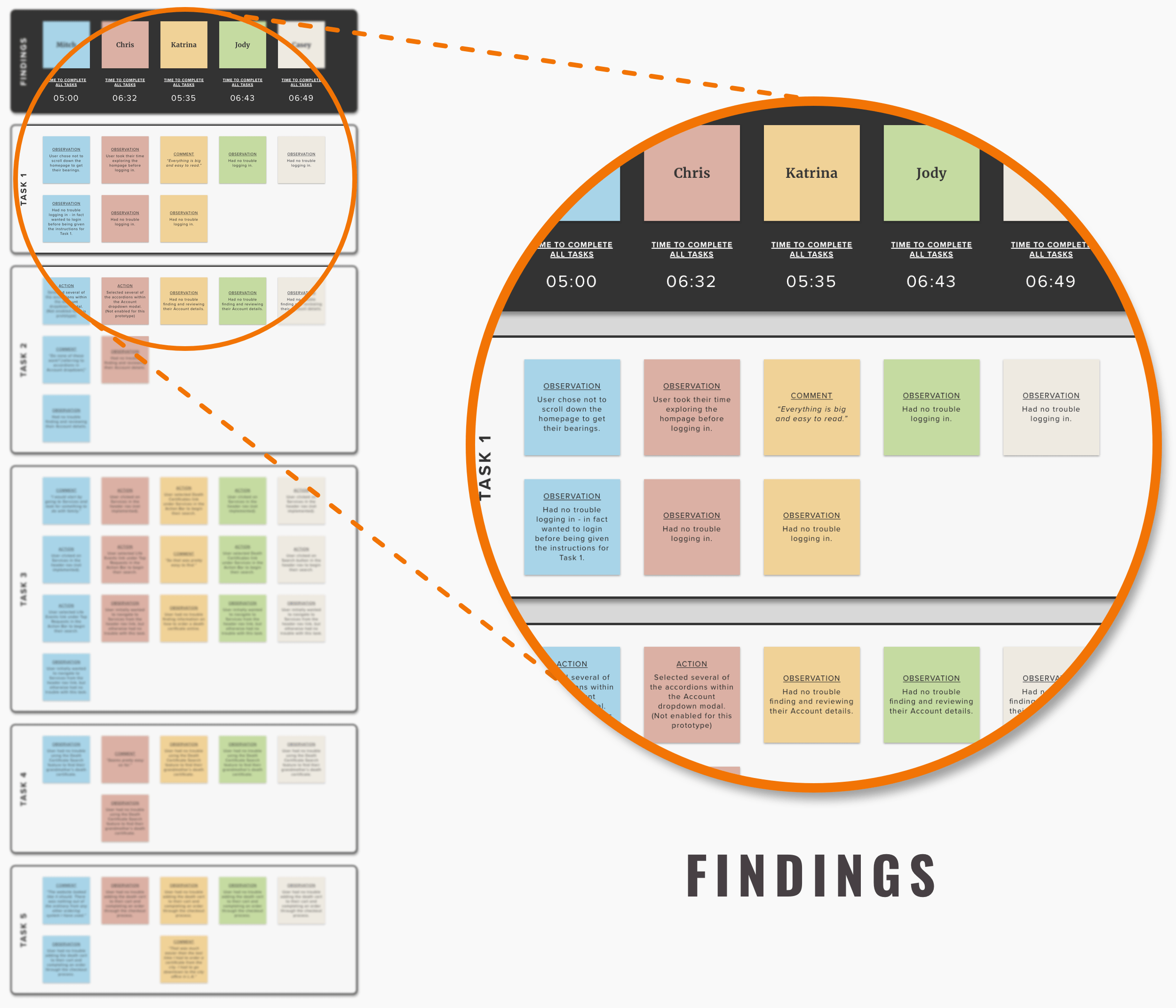
AFFINITY MAP CATEGORIES
Findings
Successes
Patterns
Survey
Insights
ITERATE
GOALS: Update the design based on insights from the usability testing
METHODOLOGIES: Priority Revisions
PRIORITY REVISIONS
I updated the design for the header navigation based on the recommended revisions defined in the Affinity Map. In this case I created a dropdown menu that lists popular services under the “Services” header navigation link in order to save the user time and frustration.
Newly designed dropdown menu for the “Services” header navigation link.
CONCLUSION
REFLECTION
I have to admit, this project was challenging in a number of ways, not the least of which was deciding to put it down and move on to the next project. Overall I came away with three key takeaways.
Under-developed Key Experience Drivers: It was difficult incorporating all the KEDs and found that the “Proactive” KED was the most under-developed. In order to see it properly incorporated, I would have liked to design and test a Chatbot Assistant feature.
Concise Webcopy: While I did address this somewhat by breaking up the “Ordering A Death Certificate” page content into the respective categories of “Online”, “In-Person”, and “By Mail”, I find that many of the pages on the St Louis City website are still too verbose and could use some clever ways to truncate it and prevent users from feeling overwhelmed.
On Lean UX: Perhaps most challenging of all, was attempting to use a Lean UX strategy to complete this project. Why? Mostly due to the fact that a Lean UX strategy incorporates regular collaboration and brainstorming with stakeholders and department experts like developers, engineers, product managers, and designers. However, since I was working solo and had no foreknowledge of the product, I needed to necessarily conduct more research and make perhaps less informed assumptions.
NEXT STEPS
Hand-off design specs to developers and stakeholders
Integrate the latest iteration into the prototype and test with participants for usability
Improve the Proactive KED by creating accordion interactions and details for the content listed in the city resident user Account dropdown menu
Improve the Proactive KED by creating a Chatbot Assistant feature in the prototype